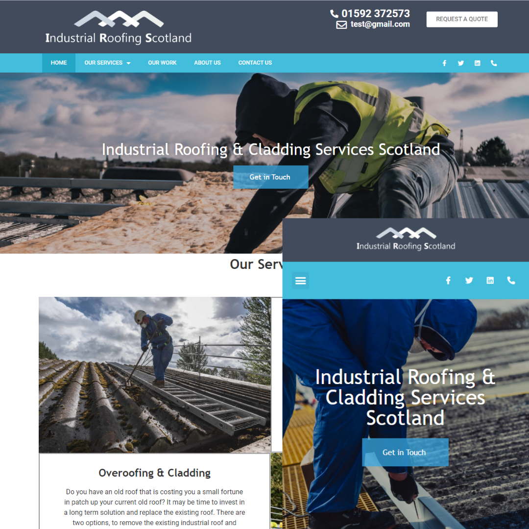
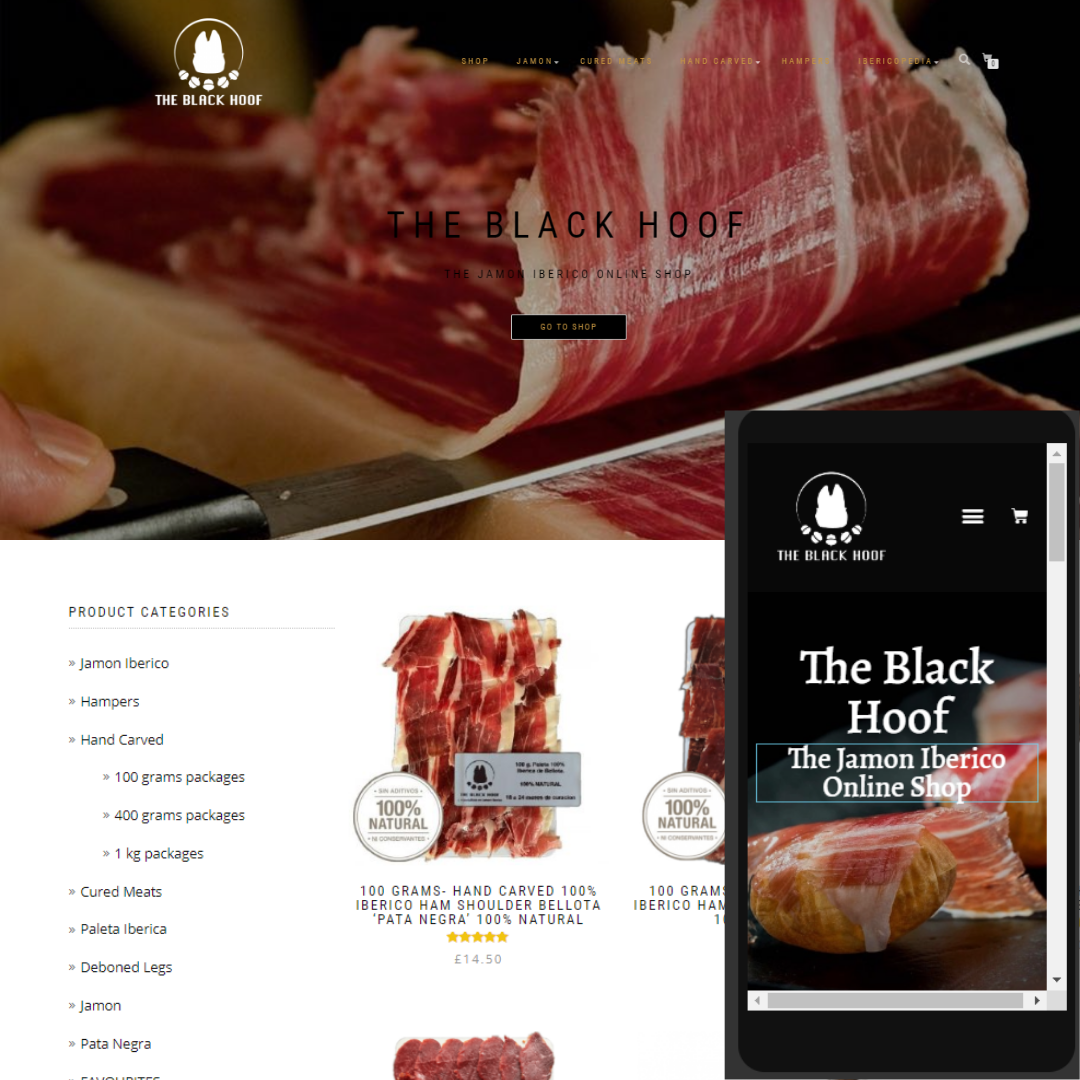
It’s estimated that around 70% of Google searches are now carried out on mobile devices, yet we still see websites which don’t load properly when displayed on certain devices like smartphones and tablets. This doesn’t just affect the experience of visitors to your website, it also harms your credibility with search engines like Google, who won’t want to display a website that can’t load properly. Long story short, if you want to keep users and the Google gods happy, you’ve got to get mobile. Luckily, every site that we design is fully mobile responsive, ensuring a pleasant experience for all users.
Our websites are not only ‘responsive’, but they can be completely adaptable- this means that a customer will see different content depending on which device they are using. If you don’t know how this works, if you are reading this on a desktop/laptop, change the screen size and you will see the hero image change. And visa versa.
What this means for you, is an increased user experience, increased conversions & higher rankings on Google’s mobile index (Desktop & mobile results are different). On a computer, customers are looking for detailed information & to make large purchases, while mobile users are usually making quick enquirey searches- most first time users on your website will be from a mobile device. Therefore, on the desktop version we would add more content such as videos & purchase call to actions. On a mobile we will reduce the content and create call to actions such as a ‘call us’ button which can be exclusively used by a mobile user.
Click the picture for more mobile optimization information